July 3, 2026
Starting Over
This redesign was inspired by a font, an illustration, and being confined to an airplane at 30,000 feet for two 11-hour travel days.
Last month we traveled to Luquillo, Puerto Rico for a week to celebrate my daughter graduating high school. Knowing my wife and kids would be occupied with books, movies, and naps on the flight, I figured I’d take advantage of the speed of Claude Code and scratch that itch by playing with this font and color palette combo that had been running laps in my brain for weeks.
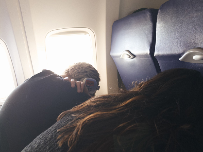
I absolutely love designing in the browser. Orchestrating markup and styles to bring content to life through typography, color, layout, and motion has been a personal joy of mine for decades. The modern era of AI has dampened that joy a bit in my day-to-day work just from the sheer speed of output and my personal role shifting from execution to direction. That being said, this was a perfect use case for AI. I was able to iterate through concepts and finalize decisions exponentially faster than if I was noodling away on my own.
I made a few choices before we boarded the flight:
- I’ve adored Connary Fagen’s Greycliff font for years and wanted to put it to work.
- I built a color palette from this rad Travis Knight illustration I saw on Instagram.
- I wanted to use SvelteKit because it’s lightweight, easy to understand (for me, as a designer), and I fancy their logo.
- I would keep it simple, no scroll-jacking, superfluous shaders or obnoxious front-end flourish. My hope was the end result would be like a favorite poster on the wall: simple and beautiful.
- I wouldn’t change my content at all, this was strictly an aesthetic overhaul so that I could ship it with minimal effort 😂
That mostly worked out. I was able to get 90% there on the 11-hour journey out of DIA. The remaining 10% took another four weeks. Once the flight landed, I packed the laptop away and spent a week enjoying Puerto Rico with my family.
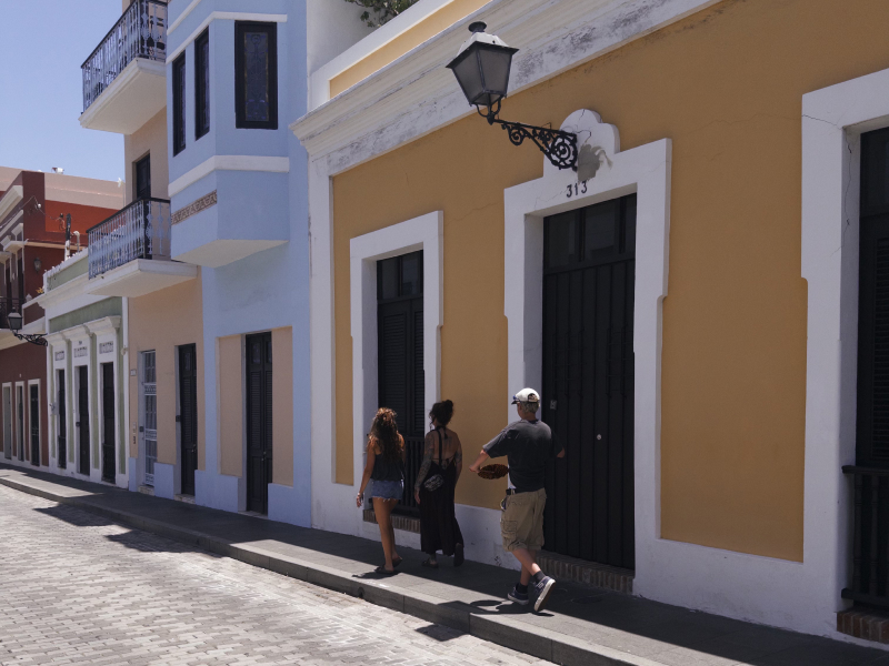
I thought for sure I’d wrap it up on the returning flight, but once it was almost complete, I burned hours waffling over the most trivial stuff. Do the margins between the eyebrow and heading feel right? Are these section gradients working or are they annoying? It’s absurd how difficult it is to design for yourself. I second-guessed every detail of this site you’re reading right now. I eventually landed in a place that feels comfortable. The colors are out of my wheelhouse but they’re expressive and fun. Dark mode looks great too!
The site feels authentic and human and that was my intent. AI allowed me to move fast but the direction, the “taste” (I can’t stand that word), that’s all me. At least until I get another itch to scratch.